How can we convey information about taxes in a way that makes it less mundane?
I created a social media campaign and infographic for a fin tech start up as part of a pitch for their marketing and brand designer. The brief was to establish them as the go to resource for all things related to tax in the UK, through the social media campaign and simplify tax processes for people through content and information design. The voice and tone of the brand, the colours and typography were quite clearly stated, so the idea was to build on the existing guidelines for visuals that made it effective.
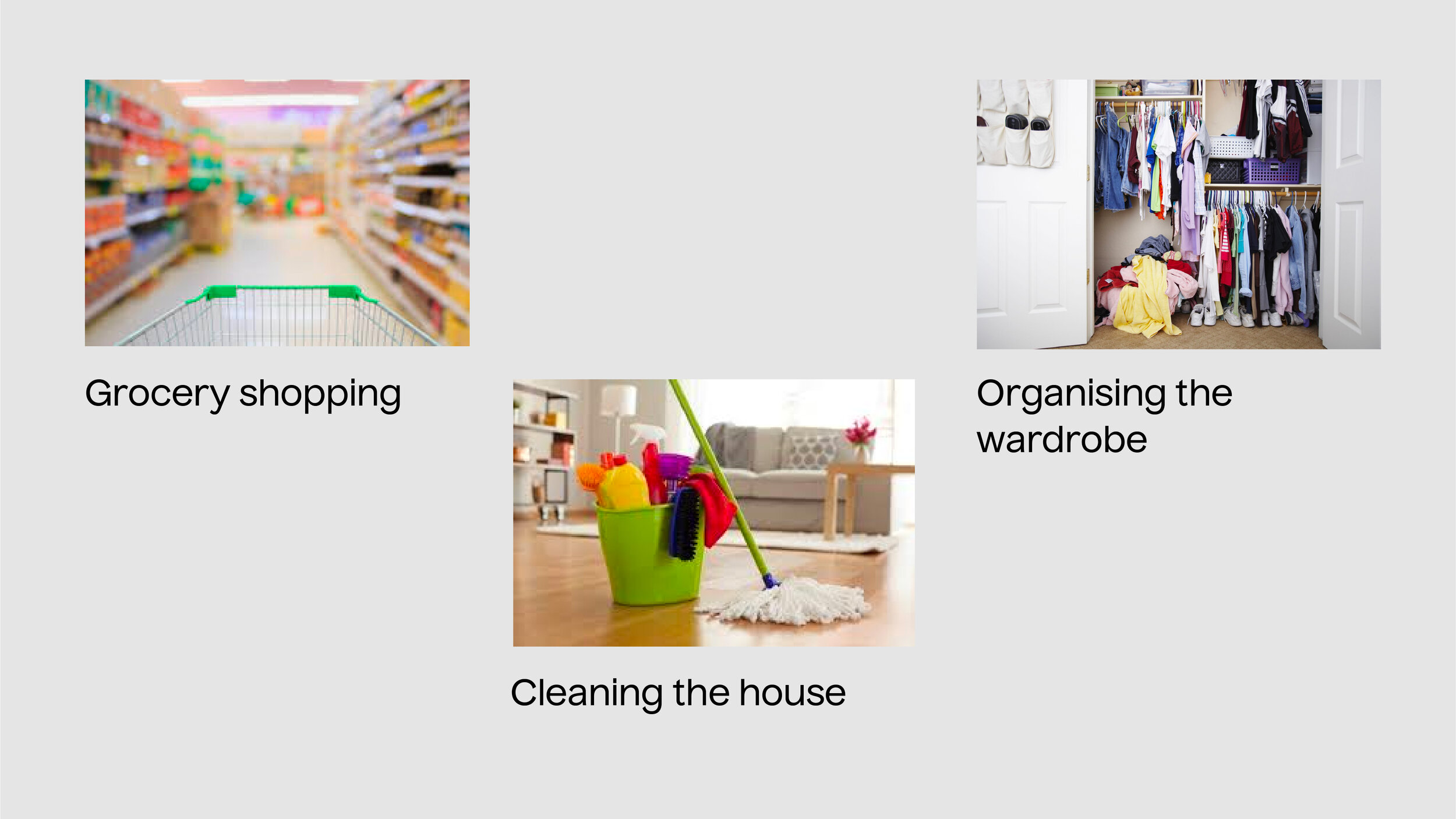
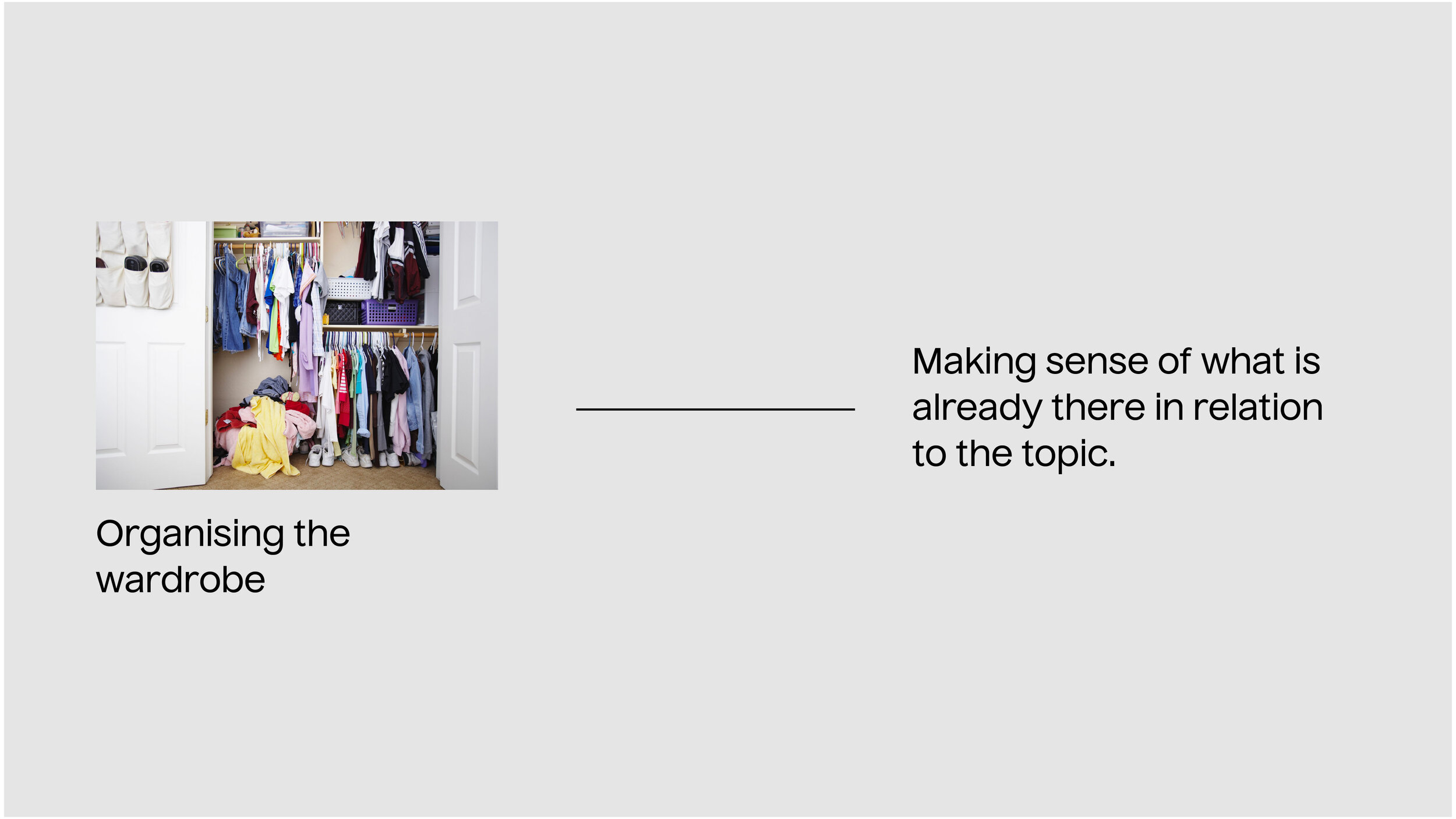
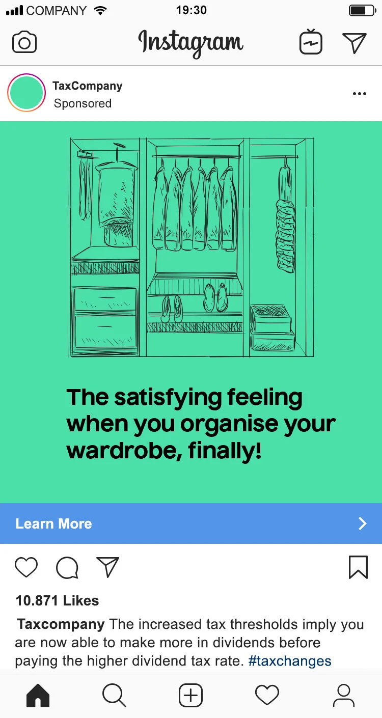
The brand book described the idea of simplifying taxes to such an extent, where it becomes as simple as buying a pair of socks online - to take away from the anxiety associated with the entire process. While brainstorming for the campaign, parallels were drawn to other day to day activities that seemed repetitive and mundane to do, but once completed, brought a huge sigh of relief.
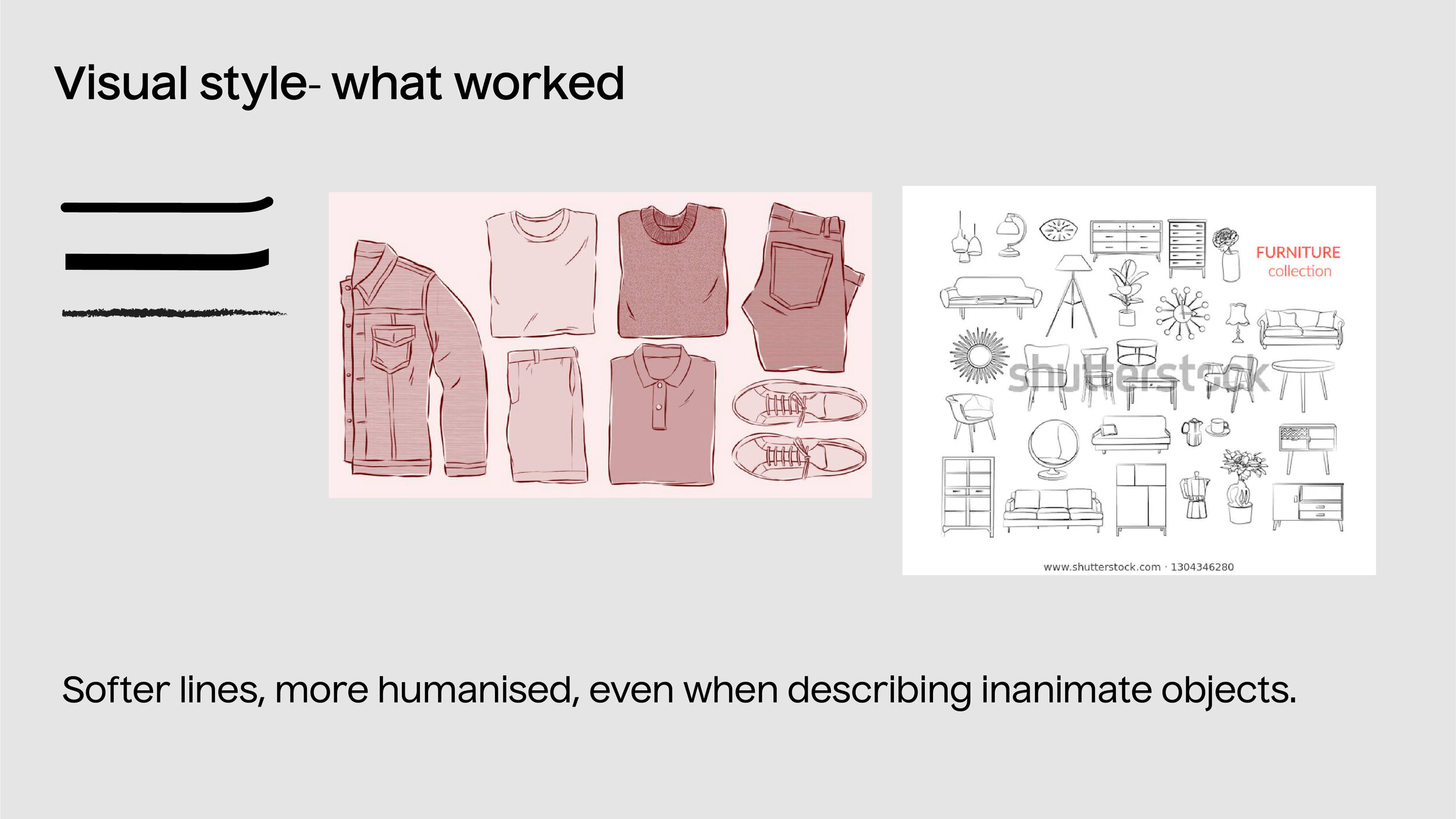
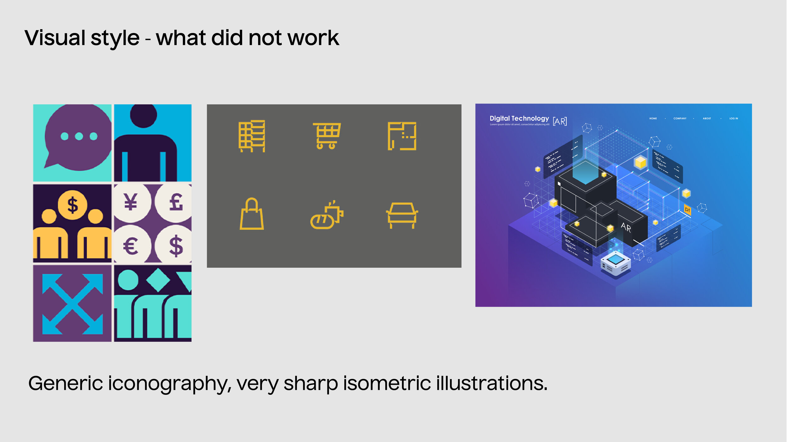
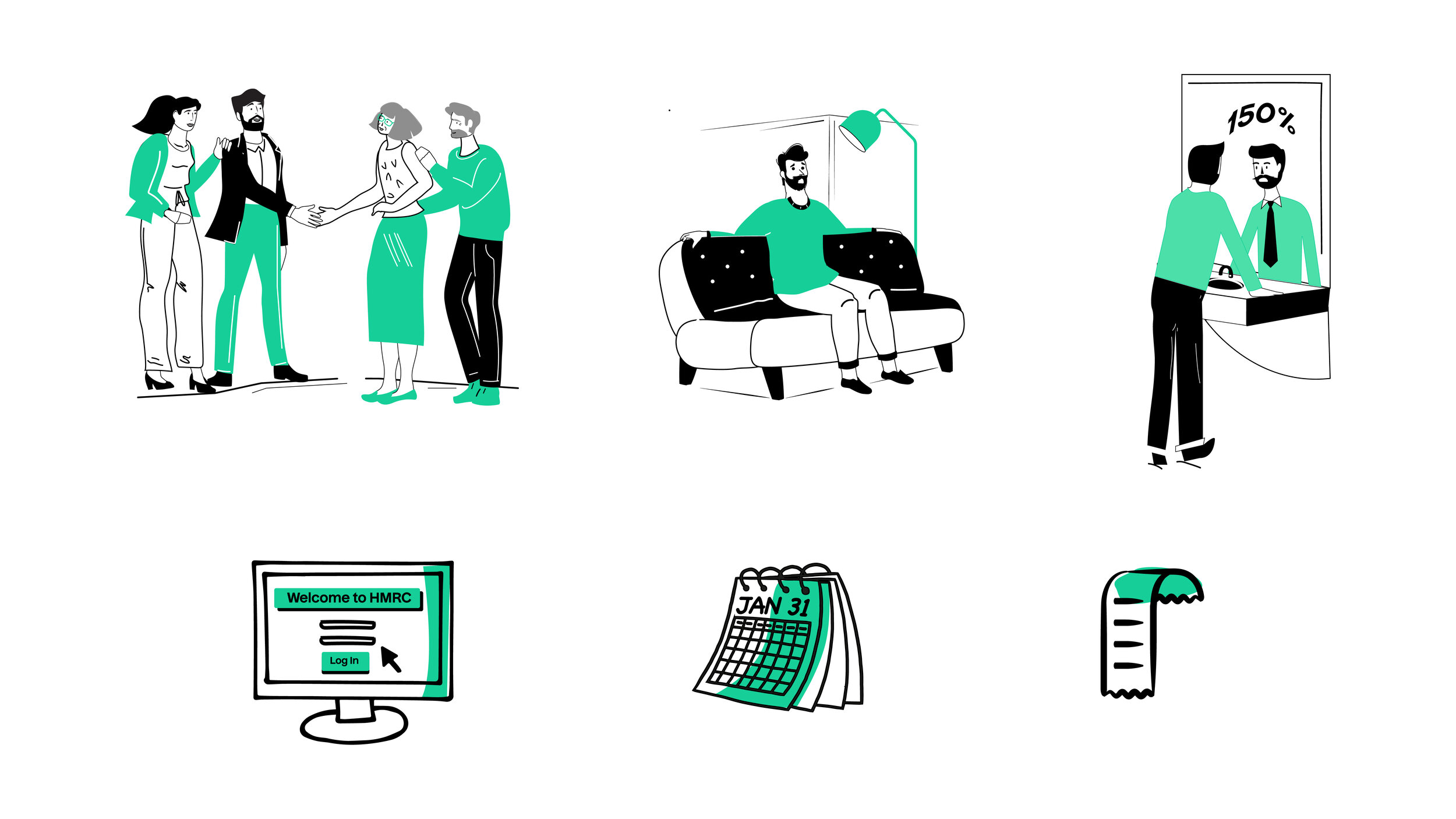
Defining the style of the illustration.
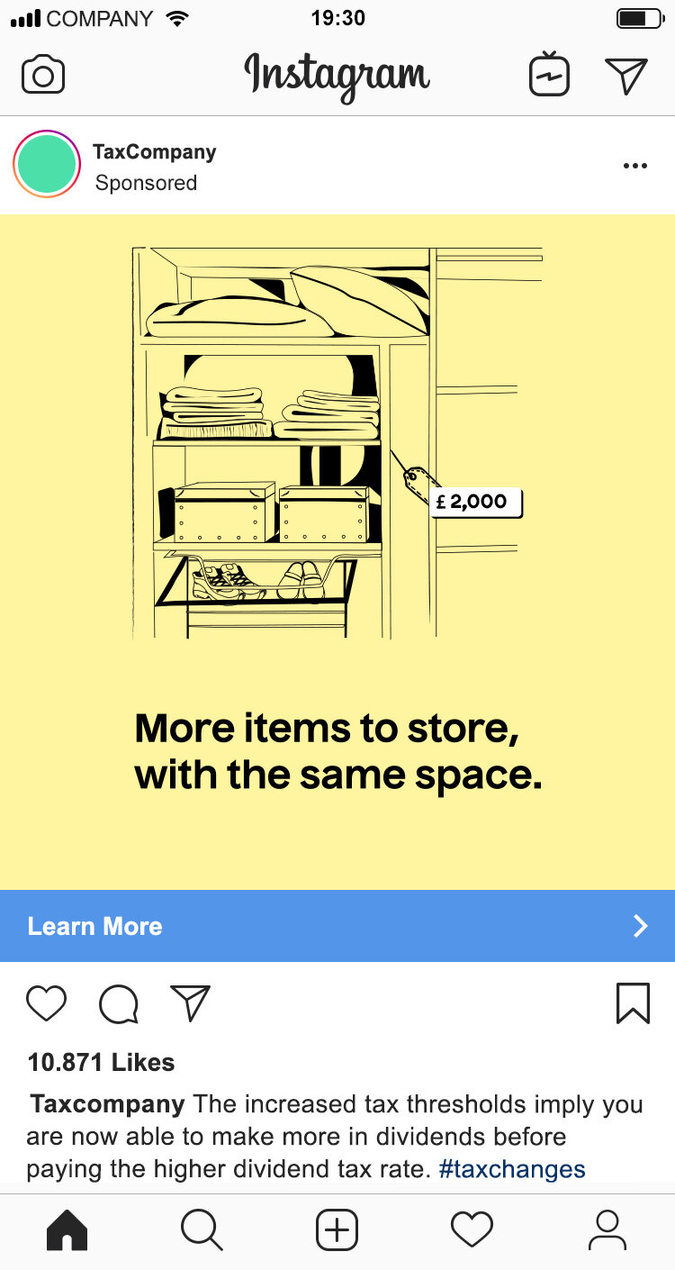
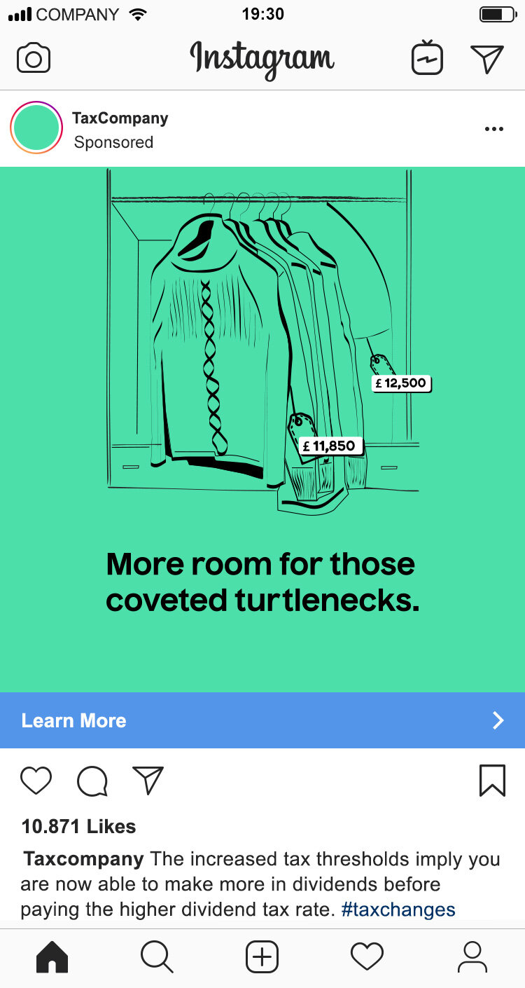
Mock ups of Instagram ads
Brand name changed to maintain confidentiality
The infographic had to be more precise in the way the information was conveyed, as it was more heavy in terms of content, but there was an effort made to make it more relatable, by keeping the layout simple, but comparing the task of doing taxes self employed to visiting the in-laws twice a year.
Character style and icon design
The final infographic
