How can we refresh the existing visual brand for a global tech marketing agency?
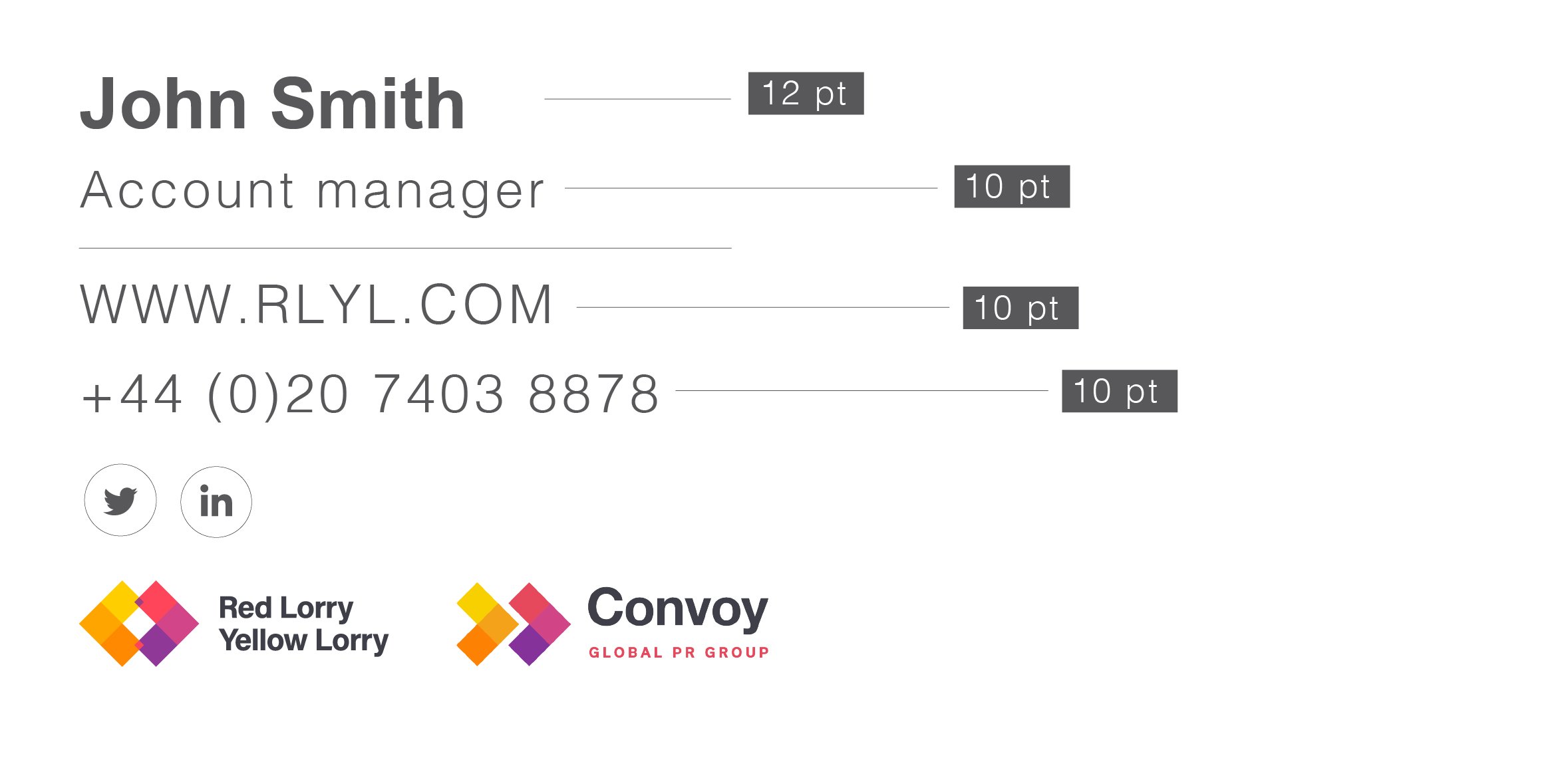
I worked with Red Lorry Yellow Lorry, a B2B PR tech and integrated marketing agency, on rebranding their look and feel to fit the culture and tone of voice of the agency. The lorries experienced a surge in clients and new hires in 2021; with 6 offices spanning 2 continents, the new decks/collateral had to be created in such a way that they would appear similar even modified by people across different offices. The brand book was created keeping in mind the tone of voice which was relaxed and professional. It contained various examples of how the new brand language would work across social media banners, decks, proposals and email signatures.
Client: Red Lorry Yellow Lorry
Project manager: Sam Pudwell
Here is a link to the brand guide.
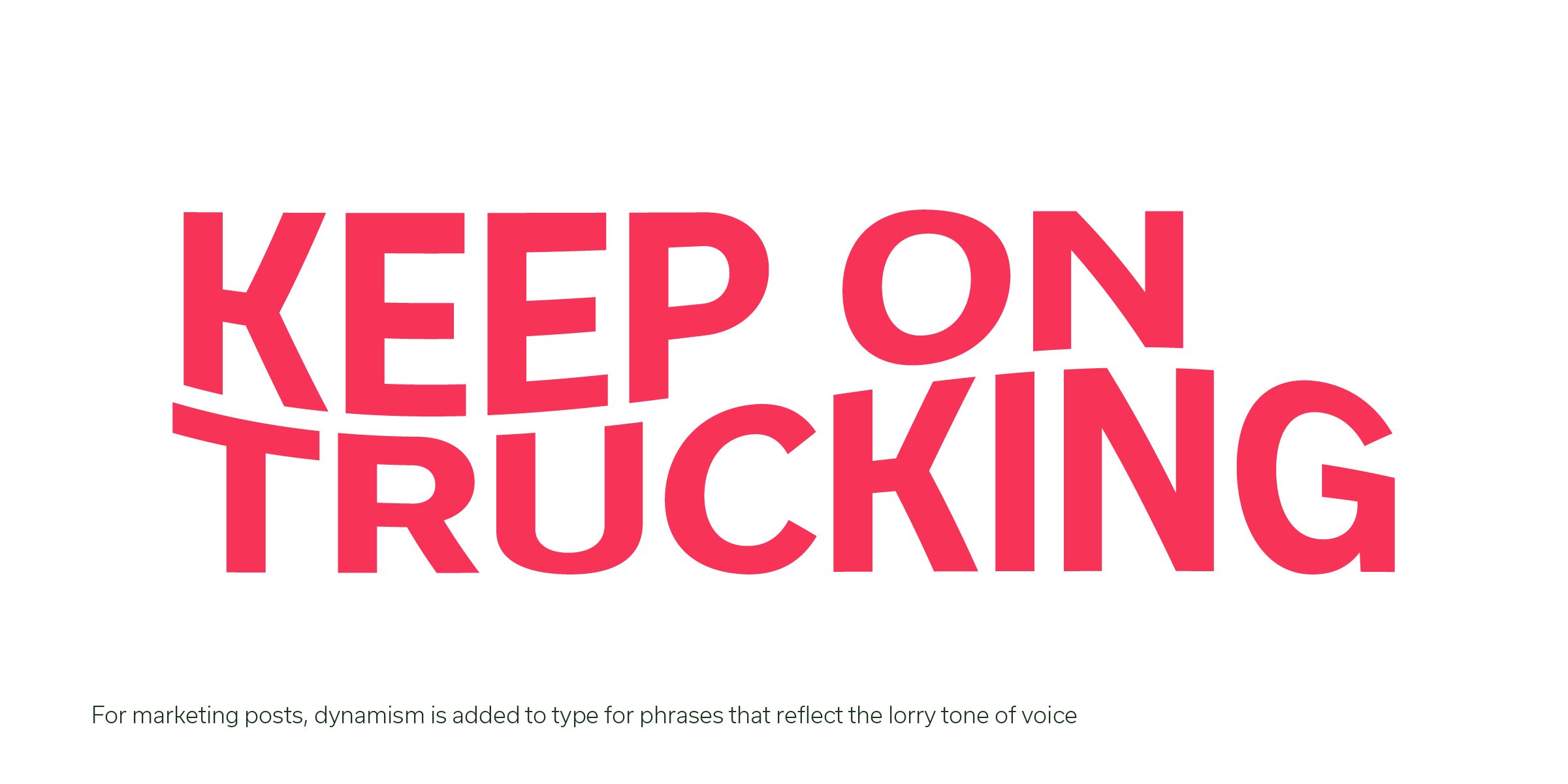
A library of icons was created and curated to make the presentations more visual and add depth to the content. There was also paid to treatment of type and hierarchy in the digital assets to make them more appealing to our internal and external audiences.
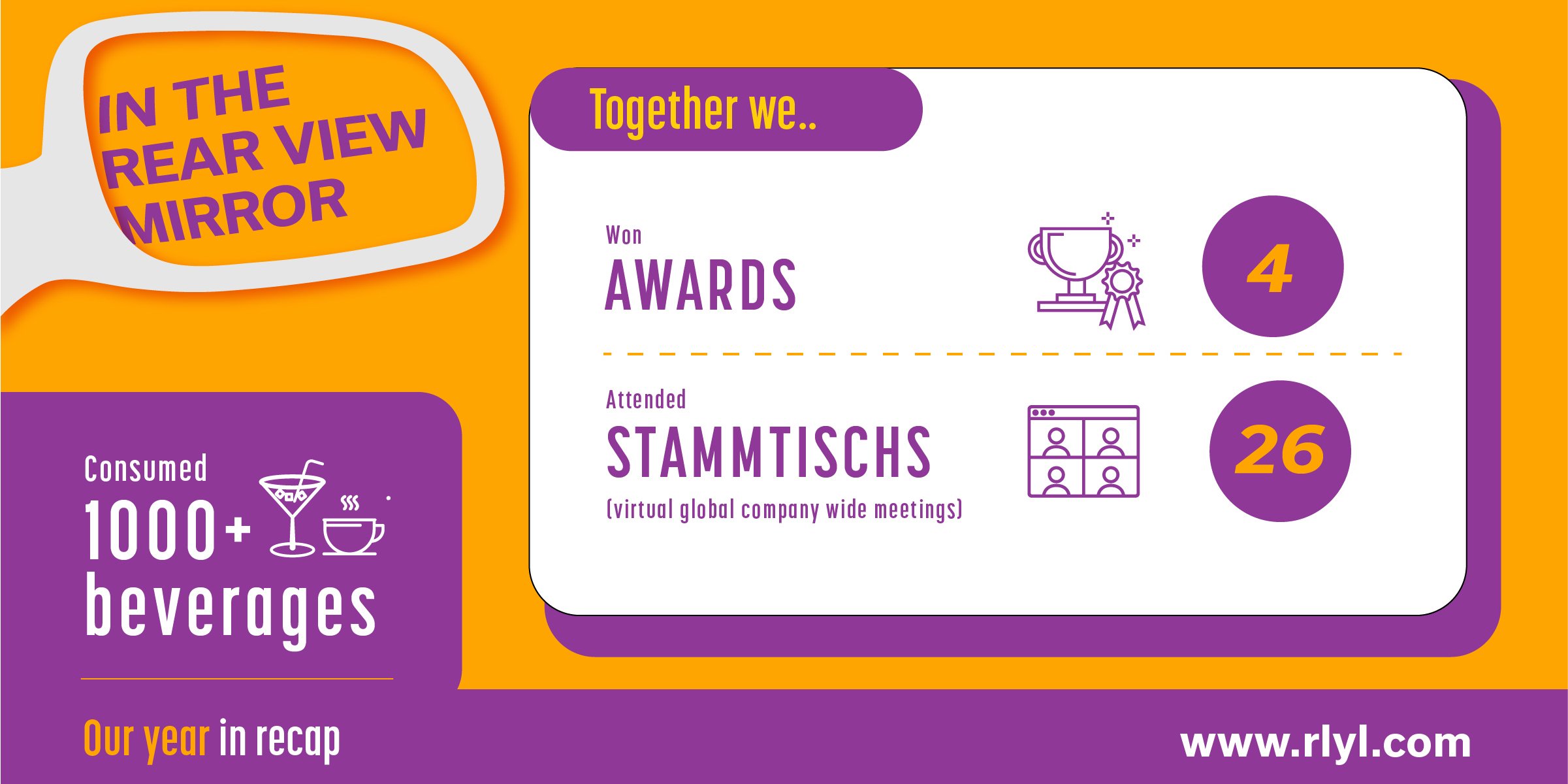
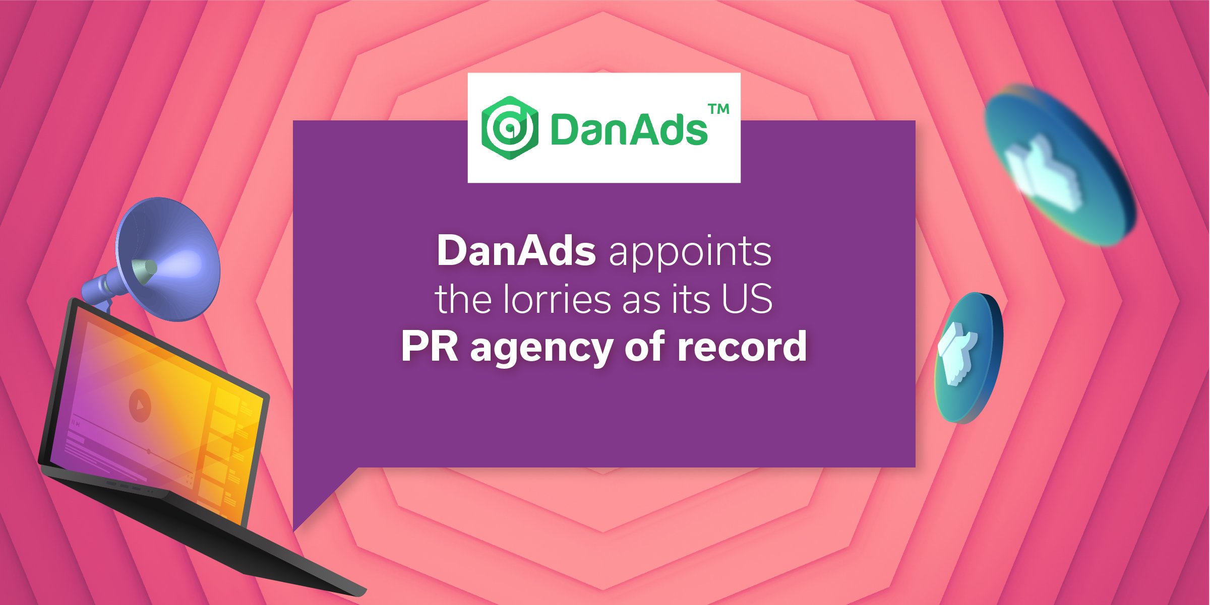
We used the brand language in terms of colour and layout vividly on social media for campaigns.
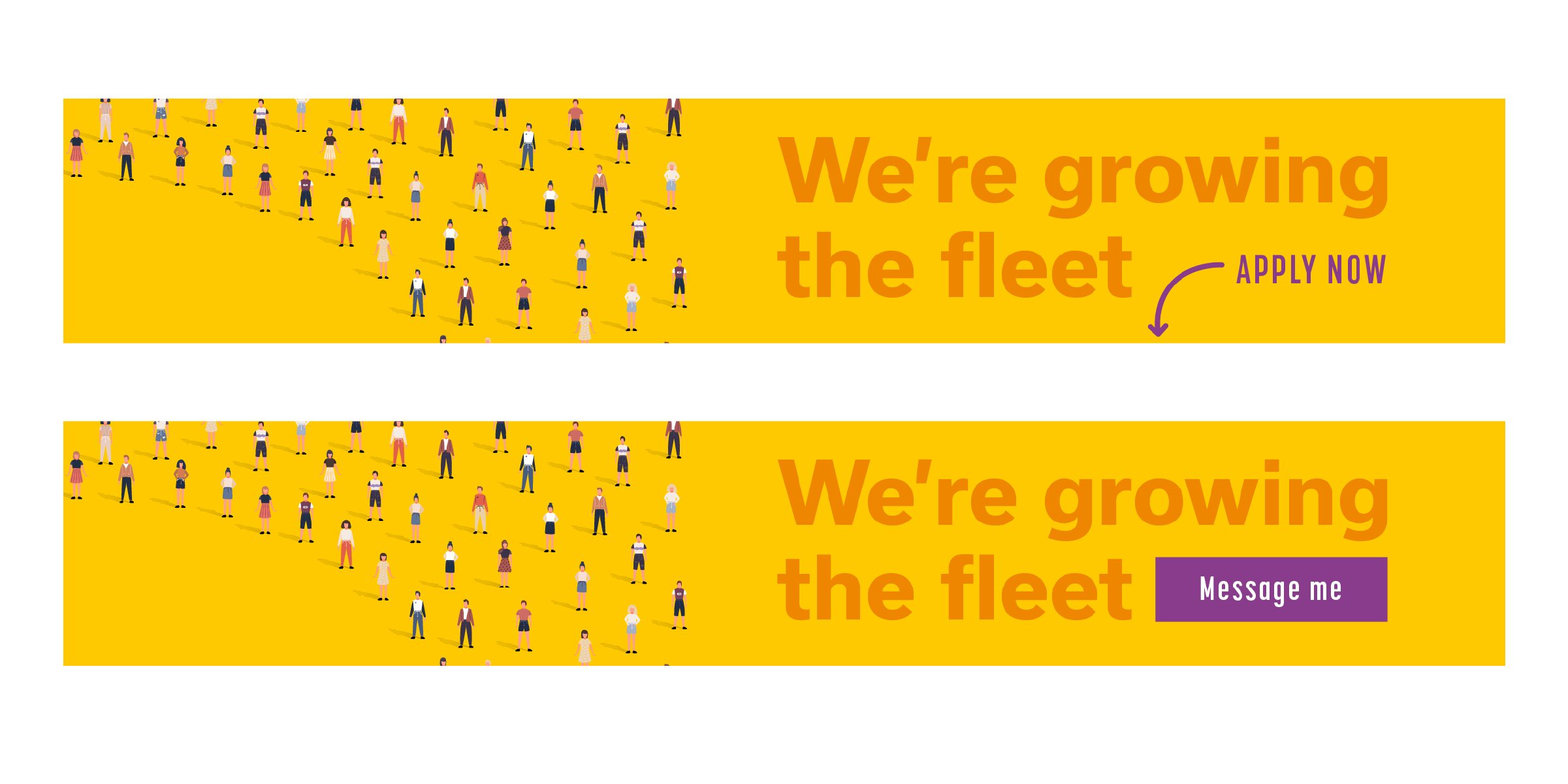
In order to meet the demand for new employees we executed in-house PPC campaigns to get the word out and generate brand awareness.
There was a huge amount of content produced within the agency in the form of client win announcements, company wide announcements and blogs written by the lorries. These all required different visual treatments and helped increase engagement on social media.
A mixed media gif created to announce the lorries being declared a finalist for at the Platinum PR awards in 2021.
A short video announcement for the US lorries winning four Bell Ringer awards in 2022
A short animated video for Christmas and the holidays
